Basic Colour Theory
To understand the fundamentals of Colour Theory we need to first ask; What is Colour and how do we see it?
The two main sources of light that create the colours we see come from the sun and artificial lighting. Light from the sun allows us to see things during the day as well as during the night when the sun’s light is reflected off the moon. There is a visible spectrum of colors that humans can see including Red, Orange, Yellow, Green, Blue, Indigo, and Violet. White light as we know it comprises of all of these colours together and the absence of colour is perceived as Black.

Where did the Colour Wheel come from?
In 1666 Sir Isaac Newton developed the first circular diagram of colors which is now known as the Colour Wheel, it was divided into the seven sections showing all the visible wavelengths of light or the colours of the rainbow. This was later developed into twelve derivatives of these colours and arranged with ‘Warm’ colours on one side and ‘Cool’ colours on the other.
Newton discovered that colour is not inherent in the actual object, but rather in the way our eyes and brain process what we see. For example, something that appears Red to us is actually an object that can't absorb the Red Wavelength of Light and so bounces it back, therefore what we see is a sensation that we have come to learn as the colour red. If an object appears to be white, it is because all of the light wavelengths are being bounced back from the object at the same time, and if the object looks black, it's because all of the light has been absorbed.
Coloured light enters the eye through the pupil, goes through the lens, to the back of the eye called the retina. On the retina there are groups of light sensing cones and rods that can distinguish the colours Red, Green, and Blue, he called these the Primary colours and it gave rise to the RGB Model, now predominantly used in television and visual effects created using light.
But wait a minute! I was taught the Primary colours at school as Red Yellow and Blue?

Well yes, it’s also true but it refers specifically to mixing colour pigments and paint. In 1725 Jacob Christoph Le Blon a painter and engraver from Frankfurt was the first to document that from these three colours, a multitude of others could be created, but that no combination of other pigments could recreate true Red, Blue or Yellow thus making them the dominant or Primary colours for artists.
The Colour Wheel
The Colour Wheel is broken into segments and looks somewhat like a pie chart. Each slice of pie represents a colour and they're positioned in the same order that light refracts when viewed through a prism. They fall into three groups known as Primary, Secondary and Tertiary Colours.
Primary Colours: Red, Yellow and Blue. These are the Primary colours, they’re the only pigment colors that cannot be mixed or formed by a combination of other colours, and all other colours are derived from these three hues.
Secondary Colours: Green, Orange and Purple. These are the colours formed by mixing different pairs of the primary colours.
(Yellow + Blue = Green, Red + Blue = Purple, Red + Yellow = Orange)
Tertiary Colours: Yellow-orange, red-orange, red-purple, blue-purple, blue-green & yellow-green. These are the colours formed by mixing a primary and a secondary colour.

Half of these colours are categorised as Warm and the other half as cool because they can have a physical impact on us provoking emotions and feelings of either energy or calm

What makes a good colour combination?
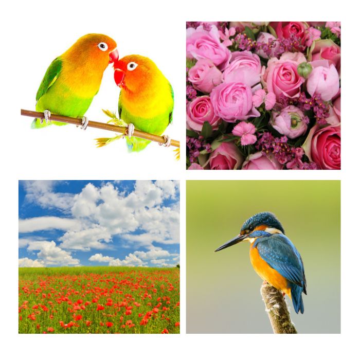
Essentially, you need to create harmony or in other words something that is pleasing to the eye, it has a natural balance and feels secure or comfortable to look at, it engages the human eye and brain in a way that they can understand and so becomes a pleasant experience. The opposite of this would be for something to either clash or jar giving an awkward, disjointed and even uncomfortable feeling or, to be so bland that it simply doesn’t register as a point of interest at all. Often Nature can inspire us and shows us these colour combinations without us realising what they are

Some people think that creating harmony with colour is a natural gift and that not everyone has it but, I believe it is a skill that can be learnt by understanding certain ‘rules’ and applying them to the colour wheel. Often it is just a case of having the confidence to trust the combinations, and once you have the grasp of it you can apply these ‘rules’ to making jewellery, creating a painting, fashion design, even down to what colours to use in your interior decorating.
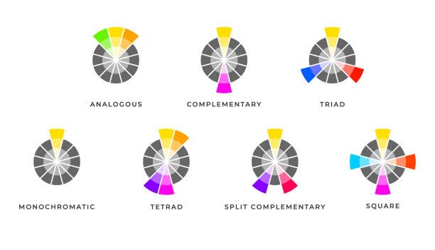
Seven Harmonious Colour Combinations
Analogous - This is where the colours sit next to each other on the colour wheel
Complementary - This is using opposite colours on the colour wheel and has the most impact
Split Complementary - This is using the colours either side of its opposite so give a softer contrast
Triangle/Triadic - Imagine an equilateral triangle has been placed on the colour wheel, it’s three tips point to colours equidistant from each other around the wheel
Square/Quadratic - Imagine a Square has been placed on the colour wheel, the four corners point to colours equidistant to each other around the wheel
Rectangle/Tetradic - Imagine a Rectangle has been placed on the colour wheel, the four corners point to colours and is similar to the square but provides a more subtle combination
Monochrome- Most people think this means Black, White and Grey but it actually means using a single source colour and selecting various tones of the same colour to go with it

Gemstones in all the colours of the rainbow
Now that you have the templates to create harmonious colour combinations, you can apply them to your jewellery making and select gemstones that fit your chosen framework. If you are still stuck, try picking your favourite colour and then work from there, embrace the rainbow and make jewellery that makes you smile!
Follow this link to find your favourites - Gemstones Galore!
.jpg)

